Saturday, May 23, 2015

Teaching Texture

Do you need a way to introduce texture to 2nd graders?  This lesson may be an easy way for the little ones to understand the concept.

You can read on...

Have the kids draw and cut out a bird and a branch from some colored paper. They can create a pattern on the bird with markers by adding repeated lines, shapes and colors to it.

You'll get lots of variety, as you can see below.


After they have designed their patterns they can pick out a feather that they think will match with their bird. (This is the most exciting part for the kids!) Let the students feel the softness of the feather. You can let the kids know that the soft feeling is what texture is. The feather can then be added to the bird as a tail with white glue.


The kids can then finish up by adding a night sky with maybe a moon and  some stars.


They come out kinda cute, don't cha think?

What do think of these texture birds? Would they work in your art class?
You can leave a comment below.

Sunday, May 17, 2015

St. Basil's Cathedral- Water Color Lesson

My lesson about St. Basil's Cathedral always worked well when it was taught at the middle school level. So I wanted to  modify it and try it at the elementary level with my 4th graders. 

Well, guess what? This lesson came out really well! My 4th graders did another great job when they designed their cathedrals. Woo Hoo, 4th grade!


This lesson starts out with a Keynote slide presentation about the history of the cathedral. Besides all the historical stuff, the kids get to see pictures of the cathedral with all its bright, cartoonish colors and patterns. Learn about what an 'onion' dome is. And they also see the geometric set up of the 9 towers ( 8 small towers around the 9th large tower) that make up the cathedral. 


A work in progress


On their projects, the kids have to draw at least four towers, two of them overlapping. As you can see, a lot of the kids decided to draw more than four towers and overlap more than two. (Woo hoo, for motivated kids!) The towers need to be designed with patterns using color, shape and lines. Doors and windows are also required to  be added.


Patterns colored with colored pencils


The sky is painted in watercolor. Either one color or two/three blended colors. The kids could then choose to color in the towers with colored pencils or markers. The cathedrals were all outlined in Sharpie. 


A creative take on the project


What do you think about this lesson on St. Basil's Cathedral? Would it work in your  elementary art class?
You can comment below.


  Oh yea,  if you're interested, you can find more art lessons about
 architecture if you look here.

Wednesday, May 13, 2015

How About A Cubist Collage Portrait?

How about some Cubism for your 3rd graders?

You get  to introduce Pablo Picasso to the kids. Bring in the multi- cultural background of African masks, which influenced Picasso's style. That led to him becoming an innovator in the whole Cubist movement. And you also get to bring in some math vocabulary by introducing geometric shapes. That's a 3 for 1 - in one art lesson! Yea, for that!


After viewing a Keynote presentation about Picasso and his art style, we start out drawing the head and neck for the portrait. They use peach colored manila paper (I have loads of it) to draw on. If the kids want darker skin, they can color in the peach paper with crayons or colored pencil.


During the second class, we have a review of the differences between organic and geometric shapes. The kids then get to chose colors out of a scrap box to cut out geometric shapes for their facial features.


The features are drawn on  to the geometric shapes with pencil. Afterwards they use Sharpie to trace over the pencil drawing. This makes the features really stand out!


The kids then can color in the hair, shirt and other items that need to be colored in. And glue everything down.

The last thing the kids do is to cut out the portraits. We then glue them onto background paper.


What do you think of our Cubist portraits? Would they work in your art class? You can comment below!

Sunday, May 10, 2015

Super Cute Shadow Portraits


Do you want a fun, creative way for the kids to draw a  portrait? How about a shadow portrait! I've seen a couple of ways teachers make these on Pinterest. But let me show you how my fourth graders made theirs. 

They come out super cute. (Don't cha think.) And it's a great way to introduce portraiture and symbolism.


Here's how it goes! When we draw full length portraits, I always have the kids draw the waist line first, centered in the paper. We then take a few moments discussing  the proportion of the legs. How a person will look taller or shorter depending on the length of the legs. They can then decide if they want their portrait to have pants, skirts, shorts, etc.

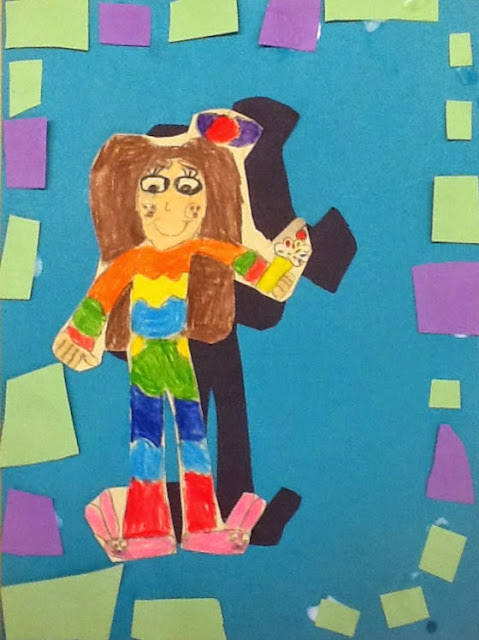
Portrait with bunny slippers and an ice cream cone.


Next, they can then move on to drawing in the chest, arms, neck and head. Put in facial features. And design their hair style.


Along the way they are reminded of basic tips when you're drawing people. The head is wider that the neck. Boy shoulders are generally wider than girl shoulders, etc.


The one thing that is required of the kid's portrait is to have symbol in their hand that reflects them. It could be a symbol of a hobby they like, a sport they participate in, a career they want to pursue when they're older.  As you can see in the samples, they come up with a lot of different ideas- flowers, baseballs, food, etc. 

And they can add more than one symbol. Which many do! As you can see on one of the above portraits with bunny slippers and an ice cream cone.


The hardest part of the lesson is cutting out the shadow and the portrait. (Teacher alert!!!) They have to cut the  peach colored portrait paper (they can color is brown/tan for darker colored skin) and the black construction paper for the shadow at the same time. This can be difficult for some.

After they put the two papers together, they cut around the body in an 'egg' shape. That way they get rid of the excess paper that can trip them up when they're cutting the more intricate parts. You can see how I marked the cutting lines below.


After cutting out the excess paper, go in and cut around closer to the body. One other hint (another teacher alert!!!)- keep readjusting the two papers after 3 or 4 cuts.  Remember-  keep repeating this lot!!!


When they are ready to glue, they place the black shadow first on to the center of green (or background) paper. The colored portrait is then placed next- below the shadow and to the left or right.

The last step is to create a border around the edge using scrap papers.

What do you think of these portraits? Would they work in your art class? You can leave a comment below.