Pages

Monday, April 27, 2015

Japanese Manga- A Graphic Storytelling Art Lesson

Manga (Japanese comics)  is very   popular with the kids. So having an art lesson that involves Manga will be  high interest in an art class.


Most of the kids are familiar with American comics. And a lot know all about Japanese Manga. Comparing and contrasting art work is one of our State Art Standards.  So I start out the lesson comparing and contrasting Japanese Manga to American comics. The kids get a good review all the differences and similarities of how two different cultures handle graphic literature. 

Here is my hand out below. You can print it 
out if you'd like.


The requirements of the project are to have at least 4 panels, with a story that has a beginning, middle and end (literacy!). As you can see in the student samples, some of the kids chose to add more than 4 panels to their stories. Woo Hoo!

Another requirement is to make up your own characters. A lot of the kids know the Japanese Manga characters and want to use them in their project. But I don't allow it. They have to make up their own characters. (Sometimes its hard to keep track of all the Manga characters, they'll try to sneak some in with out me knowing, aaargh!)


They also have to have a margin around each panel. The margin is done by measuring with a ruler. So there is little bit of a math piece  involved with this lesson also. (Yea! More integration- also in  the State Art Standards.)

The kids can chose the style they want when setting up the panels. If they chose the American way- you read the story from left to right. Or they can set the panels up the Japanese way- read the story from right to left. You'll get a lot of both styles.


What do you think of this art lesson?  Would it work in your art class? You can comment below.

Thursday, April 23, 2015

What's Your "Dream Cheeseburger" Collage

You have a chance to eat 'your dream cheeseburger'. What would it look like? Think about it for a minute. Would it have pickles and onions, tomatoes and bacon or guacamole, onion and tomato? Maybe you want to make something totally different like a Hawaiian burger with pineapples and spam, a Mac and Cheese burger or a fried egg cheese burger. 

Oh, wow! They all sound great! (Eh, well maybe some do.)

That is the question I ask the kids when we start this lesson. And we come up with a lot of ideas for that perfect cheeseburger.


After that introductory question, we watch a Keynote slide presentation that has a variety of cheeseburgers from chefs and restaurants from around the country. And even more ideas are passed around.

Then we start in, creating ours with assorted pieces of colored paper. After the pieces are cut out and glued down, we use construction paper crayons to draw in all the extra details.


What do you think of our 'dream cheeseburgers'? Would this lesson work 
in your classroom?
You can leave a comment below.

Sunday, April 19, 2015

Rizzi Inspired Collages

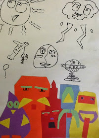
If you've ever thought about having your art class make an urban skyline? Pop artist James Rizzi's NYC skyline paintings just might be the right inspiration.


The kids really like to see his colorful, childlike images and and try to figure out what zany symbols they can find scattered through out   his paintings. 


Our inspiration- a James Rizzi skyline


The kids start off this collage by cutting out shapes for the buildings. Hint- they don't have to be realistic looking, just geometric. They are told that the buildings have to be touching or overlapping to fill up the space across the bottom of the paper.


After they have cut out and glued their buildings on they can start adding the details- windows, door, antennas, etc. I always like to give different options, so the kids can differentiate what their final project will look like. 

The kids are only required that they collage a skyline of buildings. But if the are so inspired by the Rizzi paintings, they have the option of adding an extra layer- either a highway, river or subway below the buildings, if they like. (A lot of the kids add the extra layer. Woo Hoo!)The above collage has a river added below the buildings.


The next step, after all the pieces are glued down, is to start drawing in all the zany details in the sky. They can add clouds, sun, moon, lightning, flying saucers, all inspired by Rizzi. Or they can start adding their own ideas, like the clock, balloons or helicopters. All seen below.


Take a Chance and Differentiate!

As I said earlier, I like for the kids to differentiate what's done on my lessons. It can be exciting to take a chance on trying a  variation on what we are doing. And below is an example of that. He wanted to collage the sky and just added a little Sharpie drawing on the river. Insert another, "Woo Hoo"! I think it came out great!


What do you think of our Rizzi inspired collages? Would they work in your art room?
You can comment below.


Sunday, April 12, 2015

Rough Drafts: Necessary Or Necessary Evil?

Do you have your students create a rough draft before they start their final project? When I taught middle school the kids always did. Now that I'm teaching at the elementary level,  the upper levels students in grades 4 and 5 make one as their first step.

But there's one thing at any level that doesn't change about rough drafts at any level I'm teaching at. The kids always complain about making a rough draft. They just want to get to the project.

Rough Draft

Final Project


What needs to be instilled in the kids is that rough drafts are the first step in creating. Working with a rough draft helps with the design process. It's pulling your thoughts together and working out all the kinks in your project. At least that's what I try to tell the kids. They think its just a lot of unnecessary  work.


Rough Draft

Final Project

The two biggest complaints from the kids  about the rough drafts are either:


1. Their rough draft looks better then their final project. (Which does happen, because it's a rough draft and they're not that stressed and worried working on it, like they would be with a final draft.) 

or

2. They're afraid I'll take points off because their rough draft looks messy. ( They don't get the idea that a rough draft is where your suppose to get messy and work out your ideas. Messy rough drafts are a good thing!)


Rough Draft

Final Project


 What do you think?  Do you have the kids make a rough draft? Are making rough drafts important to the design process? You can comment below.

Wednesday, April 8, 2015

Making A Collaborative Bulletin Board

The third graders at my school are studying  different types of communities. So I figured I would try to find a way to incorporate an 'urban' art lesson to go along with their unit.

Luckily, I came across Ted Edinger's blog- Art With Mr. E. (Thanks Mr. E!) He had a post about a bulletin board he made at his school, that was an urban winter snow scene. And it was all done in neutral colors.

So I thought I would use his idea, but add a twist to it. 

Y'all ready for this?

We had so much snow this winter that I didn't want to see another snowflake. Anywhere! Even on a bulletin board! So I decided   to nix any snowflakes from the scene. 


Instead, we kept the neutral colored city backdrop, but added  colorful dinosaurs that were running lose throughout the city. Jurassic Park style! Actually, one of the third grade even made a Jurassic Park jeep to driving on the road. You can see it below.


Included in the board are brontosauruses, stegosauruses, woolly mammoths, pterodactyls and and megalodons. They are running around the city as the people are casually getting on with their daily business.

As  the board was going up some of the kids walking by starting yelling 'Sharknado!' as they saw the megalodons (prehistoric sharks, for those of you who may not know) go up. So awesome, another idea! A   couple of fifth graders made a tornado with some sharks flying out of it- Sharknado style! You can see it below in the upper right.


Along with the third grades making dinosaurs, the 4th grade helped out by drawing the buildings, the second grade painted the sky and drew cars  and the first grade contributed by drawing the people. With all those grades helping out, it was really a school-wide collaborative process making the bulletin board.

Much thanks to Mr. E and his blog for the inspiration of his winter scene  bulletin board!

What do you think of our Jurassic Park/urban scene mash up collaborative bulletin board? I'm all ears! Your comments are welcome below.

If you want to read about a bulletin board for Meet The Teachers Night, check out this post.