Sunday, November 30, 2014

Portraits- With A Colorful Twist

What would happen if you ate a box of crayons?!

That's the question I ask my class when we begin this art lesson. As you can imagine, I get all kinds of answers. And some of the replies they come up with are pretty funny.


We start off drawing an oval shape for the head in the middle of the paper.  The kids then add  the eyes, nose and mouth. I usually tell the kids if their hair started changing colors their mouth would probably drop open in awe. But they can add any facial expression they like. They then add a neck and shoulders.

We then start dividing the background into into different shapes that fan out to the edges of the paper. Some lines going toward the shoulders, right and left sides and top of the paper.

They then outline all the pencil lines with a black Sharpie.


We then start discussing what patterns are- repeating lines, shapes and colors. Then the kids start designing their patterns in the hair. They use either crayons or colored pencil to create the patterns.


Oh, and here's the bulletin board I created with these. It was titled 'Look what happens... when you eat a box of crayons!!!' 


What do you think about these portraits? What do you think would happen if you ate a box of crayons? I'd love to hear if these would work in your art class.

Friday, November 28, 2014

How To Make An 'Egyptian' Mummy


Ancient Egypt is one subject that the kids always love to learn about in art class. Who can't resist a good mummy story!

The whole history of pyramids, pharaohs and mummies can be quite fascinating. I have a few different versions of making mummies, but the following is one my favorites. 


Here's how we design them!!!


We start out reviewing the whole history of the pyramids, the ancient Egyptian religious system, with their gods and goddesses, and the mummification process. After that we're ready to make our mummies.


The ancients  mummies  had pectorals  on their chest designed in  the image  of  the  Egyptian  god  Horus. The Egyptians believed that Horus guided them to the afterlife. So  the  first thing require is that the kids design  a pectoral for the mummy's chest. They can choose any symbol for  their pectoral (except Horus- it's already been done), but it must  have two wings on either side. The  mummies above have an eagle pectoral and a doughnut pectoral.


The kids then get an overview of Egyptian hieroglyphics system. They have to write a word at least 5 letters long, using the hieroglyph symbols, that they put on somewhere their mummy. Either horizontal or vertical.

They then have them make up 3 'hieroglyph' symbols of their own, that they add to their mummy. The Egyptian Hieroglyphs symbols were representation of objects  important to  Egyptian life- things such as water, loafs of bread, grass reeds, etc. The kid- designed 'hieroglyph' symbols should be objects important to their life.


Other things they are required to add to their mummies are- some kind of a crown, a few strands of jeweled necklaces and jewels in their hair.  The mummies  needed this to make sure they didn't lose their  social status in the afterlife. So they were buried in their 'bling'.


Below are a couple of mummies that kids designed in their 'own' style. Some times I let the kids do that if they're really creative and have a vision of how it will be differentiated.  Once in a while you gotta let the kids go their own way! Use some discretion and give 'em a little leeway. I think these came out really nice.


What do you think of our Egyptian mummies? Would they work in you art room? I'd love to hear what you think about them. You can comment below.

Saturday, November 22, 2014

How To Draw 2 Point Perspective Castles
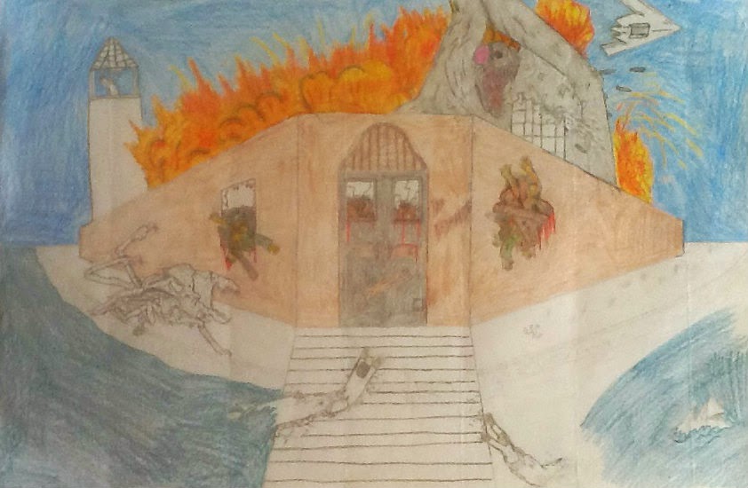

Hey, do you need an art project that injects a little history into it? Well, you might want to try this 2 point perspective project on castles.


Here's how the project is introduced.  The kids are asked- What is the difference between a palace and a castle? You'll get a lot of different answers but we eventually get to the nitty gritty: a palace is for pleasure/recreation and a castle is for protection. I then review the background history, who it protects and the different parts of a castle- the walls, the moat, the towers, etc. Reviewing all the parts of the castle helps them to  start thinking about what they will put into their castle.

There's a lot of using a ruler and measurements involved, depending on the size of your paper. The size paper we use is 12 x 18. Here's the run down on how we get  the different sections of the castle set up. Check out the visual below.


The things that are required by the kids to do are- line up windows to the vanishing points, add towers, a mote and some kind of landscaping. Kids like to add  a lot of extras such as, flags, brick work and a bridge over the moat, but I don't require those.

A work in progress
This project works well because the kids can really come up with their own twist to it. There are so many ways they can change it up and make it their own. You always get a lot of different style of castles. 


What do you think of this 2 point perspective project? Do you have a castle project that works in your art class? I'd like to hear about it in the comments below.

If you'd like to see another 2 point perspective project, check this out.